Horne & Benik Networks Blog
Other Options for Visual Excel Data
If you need to condense data into a concise and comprehensible form, Microsoft Excel is tough to beat. This is despite the fact that your average spreadsheet isn’t exactly an eye-catcher. However, Excel provides a few native options that boost your data’s visual appeal, making it more engaging and much more meaningful. We’ll review a few today.
In-Cell Charts and Sparklines
One of the biggest downsides to line after line and row after row of numbers and labels is that it becomes difficult to visualize any patterns. Both of these functions resolve that by providing clear visual cues.
Excel’s Sparkline option displays a miniaturized line graph, bar graph, or win/loss chart within a cell. This adds an added layer to the visualization. So, let’s say you want to track how many sales were made of a certain product or service offering. With a line graph Sparkline, you can create this quick reference:

You also can go even more in-depth with your styling, applying custom rules to your cells to display more granular information. Let’s assume that your goal for these specific sales was to complete at least 16 per month. Utilizing conditional formatting can make it even more obvious when this goal was (and wasn’t) reached.
With your data selected, select Conditional Formatting from the menu ribbon. Click Manage Rules and access your newly-created rule for the data set. You can then play with some of your options. In this example, we decided to use arrows as our icon style and identify 16 as both of our top values and 15 for the bottom. After you hit Apply, your data should appear like this:

As a result, you can see much more quickly which months saw enough sales to reach the set goal, and which did not. This makes it easier to identify other events that may have influenced these numbers and act accordingly.
Turning Pies into Sunburst Charts
A sunburst chart is effectively the combination of multiple pie charts into a single, unified representation. This helps you to spot important patterns that may have been missed if the graphs were left separated.
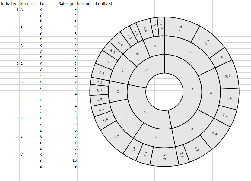
For example, let’s say you serve a variety of industries, and have specific services for each, with each service divided into tiers. By labelling each industry as 1,2, and 3, with services A, B, and C, and the tiers X, Y, and Z, you can create a sunburst chart that allows you to compare how these sales play as a part of your incoming revenue.
One this data has been divided as pictured, you can apply the sunburst chart to see the following hypothetical:

So, while you can see from the data that service 3CY outperforms any other on this chart (most by a considerable margin) by reviewing the data, the sunburst chart provides considerably more insight into this fact - primarily, the significance of such a difference. From there, you can again examine some of the factors surrounding these outcomes and adjust accordingly.
Raising the Bar with a Thermometer Chart
Thermometer chart are great for providing some motivation to your team toward a goal, although it does tend to be used primarily for financial benchmarks. However, this one can be a challenge, so be careful as you follow along.
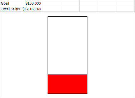
Sticking to the sales usage, let’s say our penultimate goal is $150,000, and there has been $37,163.48.
- In Excel, insert cells that look like this:

- Selecting them, click Insert, and under the Column Chart options, add a Clustered Column Chart item. With this item selected, click Switch Row/Column in the menu bar at the top of your screen.
- Right-click the Total Sales bar and select Format Data Series, then in the Series Options page, select Secondary Axis. You should now only see one bar, with labels on both sides.
- Right-click the label on the left and select Format Axis. The Axis Options Pane should appear. In the box for Maximum, type in your goal of $150,000. Repeat this process for the label on the right.
- Right-click the Goal Bar and select the Format Data Point option. Under Fill & Line in the menu that appears, select No fill and make the border a Solid line. Repeat this process with the Total Sales Bar, skipping the “No fill” part and selecting the color you want instead.
- Finally, you can delete the labels on the bottom and sides (if you wish), as well as the horizontal lines, leaving you with the finished product:

What kind of data would you express better, now that you have these tools to leverage? Share your thoughts in the comments!


Comments